Responsive Web Design: Inspiring Interaction
When you visit websites, is it always done on the same computer while sitting in the same seat looking through the same content? I’d venture to guess probably not (but if you do, 1996 just called on the land line and it wants you to come back home). Today, users take the web with them wherever they go and they interact with it using a variety of devices. They use websites to connect with friends, manage their finances, watch movies, purchase things, play games, read the news and gawk at trend-setters all while waiting in line, walking across campus, flying, riding a bus, camping, watching television at home and yes, even while driving (not smart!). How people use the web has shaped the way we design for it and instead of designing rigid content (a la 1996) sites must be designed to be flexible, dynamic and responsive in order to best serve the needs of modern users.
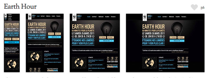
One way web design is meeting this need has been a move to design sites whose content responds to various screen sizes and constraints. As opposed to sites that simply change their size to accommodate different devices, responsively designed sites flex, morph and reconfigure themselves to best match the size of the screen upon which they are displayed. Like most things, it’s so much easer for me to share some examples of responsive web design than it is to describe it and thankfully, since 2011 there’s a glut of sites that are being designed this way. Here are a few screen shots of sites featured at mediaqueri.es that demonstrate a responsive web design approach:
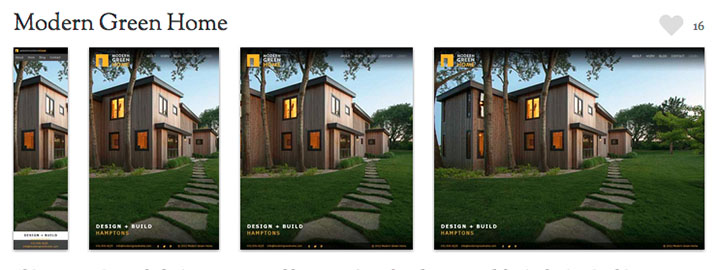
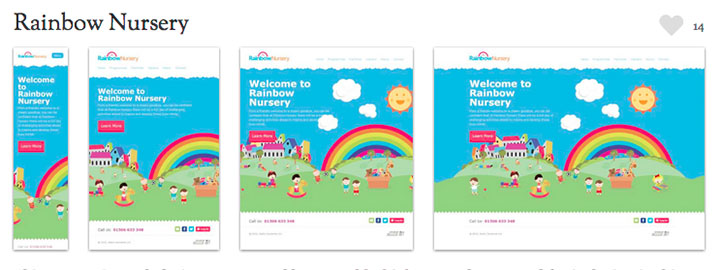
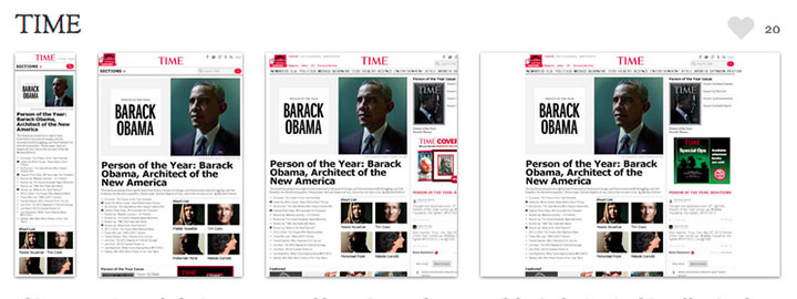

Did you notice what happened in each of these examples? As the browser window was sized down (or as the sites were displayed through different device screen sizes) the content in each of the examples responded to physical constraints. As the design of the sites responded to browser sizes, navigation shifted, type sizes changed, the stacking of content was re-ordered and images resized. As the needs of the user changed, sites didn’t just get smaller or larger, their content responded. I’d like to see 1996 try that!
But as you can imagine, designing for the web at a time when screen sizes and demands are so varied requires designers to research and to anticipate the interactions outside of the site as much as it requires a focus on what’s inside the frame of the browser. It means that, while designers must be fluent in coding HTML and Cascading Style Sheets (CSS) in order to construct sites effectively, they must also test the sites they design for how well they serve users’ needs. The changing shape of electronic media means that designing interactive content can no longer be simply crafting engaging visuals, but also engaging the interactions, themselves.
In the 17 years I’ve been designing for the web I’ve created both static sites and responsive sites and while designing responsively requires more work, it’s also a lot more fun. Web-based technologies and coding languages have advanced to where designers today have far more tools at their disposal in order to create engaging and memorable interactive experiences. The needs of users have advanced to where designers are challenged to create experiences that inform, inspire and interconnect in vastly different ways and on vastly different devices than just a few years ago. Instead of just designing static information (which is so 1996) responsive web design is an approach that enables designers to encourage interaction and last time I checked, “interaction” was a pretty big part of “interaction design.”