This semester Miami graphic design students collaborated with graduate creative writing students from Professor Ann Fisher-Wirth’s course at the University of Mississippi. Together they created the first issue of a hypothetical new poetry journal. Ole Miss students first wrote an original body of work and then Miami students developed a poetry journal around the content. The central theme for this new journal was the concept of “connections.” In addition to publication design, Miami students also explored mass customization. Each student had to develop a pragmatic system for mass producing but also individualizing each copy.
From the project brief:
“Publications are traditionally mass produced. Each copy is exactly like the next. Added value comes into play only when an author signs a copy, thereby making it unique. Recently, designers have begun to produce publications which are both mass produced and custom one off pieces. For example, Daniel Eatock’s monograph includes an area on the spine for his fingerprint. Eatock went to the warehouse storing his book and applied the fingerprint to each copy himself. Each copy is therefore unique. Copies that were not fingerprinted could be brought to book signings so that Eatock could literally add his individual touch. Designer Luna Maurer designed a publication in which the page numbers were written in by hand in charcoal. Although the rest of the publication appeared to be a traditional mass produced book, the handwritten page numbers added an individual quality to each copy. In addition to the fact that they were written by hand, the charcoal smeared as the book was handled leading to more customization. In both cases, the human touch fought the anonymity of computer generated design.”
Ole Miss students: Emileigh Barnes, Julie Ann Brandt, Wendy Buffington, Jessica Comola, Joshua Davis, Paul S. Dean, Tim Earley, Kevin Fitchett, Dorothy Knight, Michael Martin Shea, Travis Smith, Joe Zendarski
A sample of the resulting journals
===============
Sticky Mucky Gooey, designed by Adam Cassidy
My mass customization for my journal was to put honey in one of the spreads of the book. If this book was being mass produced, the honey (or some other sticky substance) would be placed in a different spread each time.
===============
Synapse, designed by Eric Villareal
Each copy of the poetry journal comes with a unique strip from a photographic print of one of the photos that the book features. This strip can be used as a bookmark. Also, the strip can point the reader to a specific section of the book, as the reader can find the photo in which their strips image was taken from. That way, the reader can interact with the book at a deeper level and each copy has specific sections or poems in the book that are implied to have special meaning to each specific reader.
===============
Hinge, designed by Katie Scott
My mass-customoization was that I tore one of the strips off and placed it in a random spread. This forces the reader to try to place it somewhere and the meaning of each poem they try to place it in hinges on their forced connection!
===============
Junction, designed by Rachel Fraleigh
Junction is kept closed with a purple ribbon band studded in unique gold buttons. The colors are symbolic of the contrasting colors, imagery, and content that runs throughout the journal. This ribbon gives the user the chance to personally interact with the concept of junction by determining which button holes to use and how to form the relationship of where two things are joined. This parallels the natural, dynamic connections that are represented in purple throughout the journal and is contrasted with the gold buttons that represent the more rigid, static connections of the buttons sewn into the ribbon at specific places.
===============
Flock, designed by Emily Schwegman
My mass customization was the inclusion of bird stickers in the book. The reader could take the stickers and place them wherever they wanted in the book and create new flocks of birds to fit the way they interpreted the poems.
===============
Link, designed by Jenna Samuels
My mass customization is a chainlink wire bookmark that is folded in half, so it can clip a group of pages together, thus linking multiple different poems. The bookmark ends will be inserted in different poetry spreads for each copy of the book.
===============
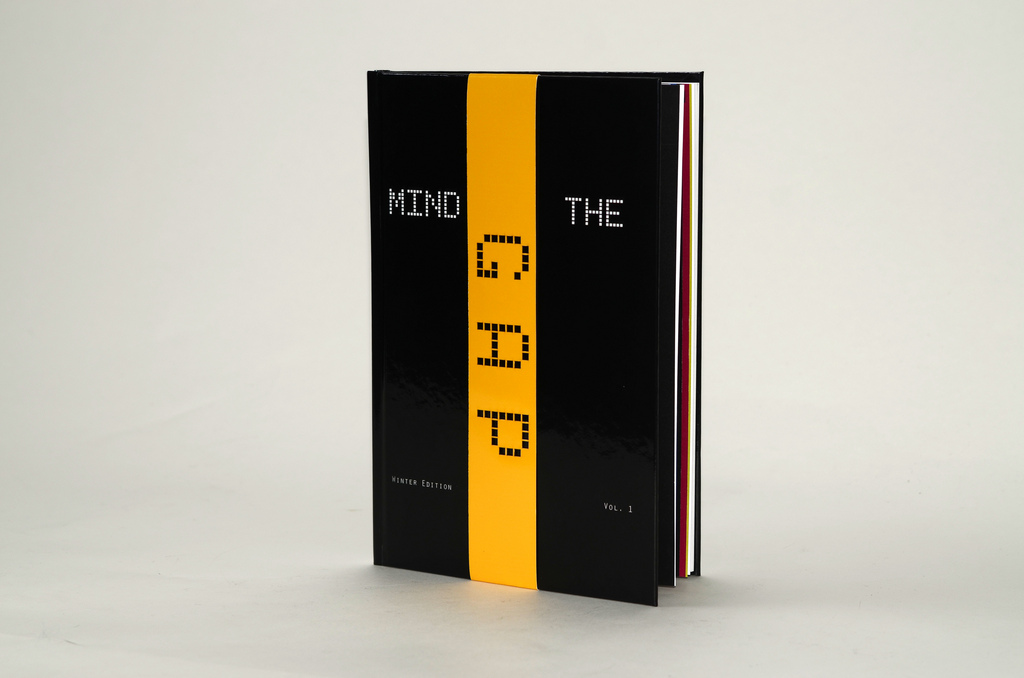
Gap, designed by Arianne Krekeler
My mass customization: the band that goes around the front cover of the book can be any one of the 12 colors that appear throughout the book and where GAP falls on the cover is different for each color as well.
===============
Root & Branch, designed by Molly Stiebler
For my mass customization element of my book, I incorporated my own hand-writing. The book focuses on relationships under the lens of “Root&Branch” in which I interpreted the Root to mean “pain beneath the surface” in a relationship. Thus, all the poems with a sad tone, describing more broken relationships are cast in the Root section. Likewise, poems with a more upbeat message are in the Branches section, which I interpreted to mean “fruit that is to come.” While dividing the poems however, I realized that many of the works could fall in either place, depending on how one interprets them. The last page in my book shows an organic image of what looks like a root. Beneath it, I have written a message. The reader, however, must turn the book upside down in order to read what it is that I’ve written: “Roots can become branches…it’s all in how you look at it.” It’s then when the reader realizes (once the book is turned over) that the root is actually a branch. It ends the book in an upbeat manner, instilling the message that hope exists for turning a relationship around.
===============