Hype in the Graphic Design Hallway
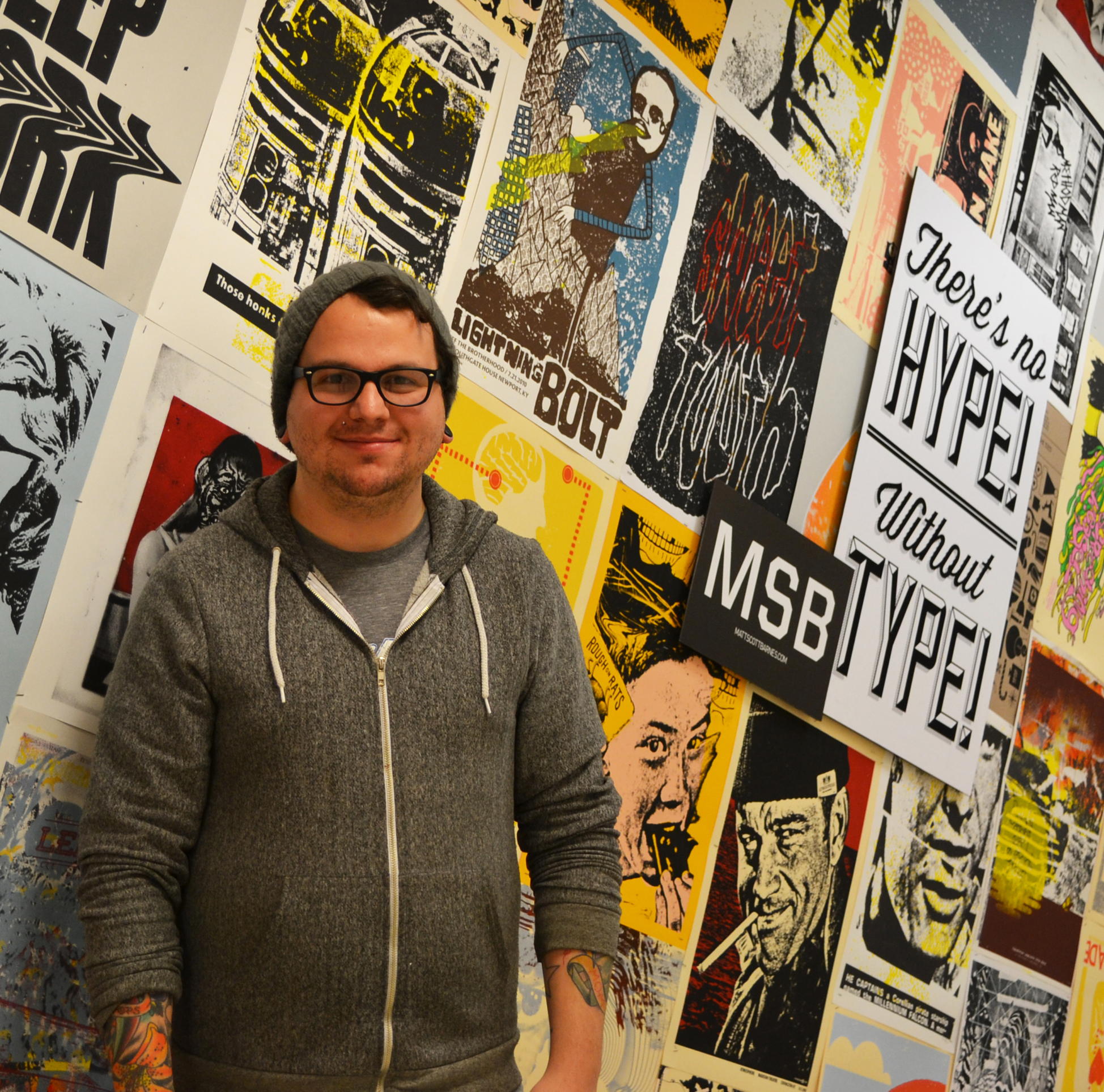
Matt Barnes is officially a “graphic designer/printmaker/strategist,” but he feels like he’s just a creator. The Spring Hand Media class and those who experience his screen printed poster installation in the Hiestand hallway describe him as awesome.
There’s no Hype! Without Type! As a preview to his workshop Matt, with the help of fellow artist Kelly Scheurich, installed a wall of his posters created while working for Powerhouse Factories. With roots in rock posters, the Cincinnati based company has grown over the years into a branding and strategy firm.
 Matt presented the Hand Media class with an overview of his journey as a young designer and screen printer. After graduating from Western Kentucky University in Graphic Design, he worked at Print Mafia, producing screen printed gig posters. He often incorporates hand drawn elements and his own typography in his wood transfer and screen print work. Matt likes to use fonts from independent type foundry Fontfabric and the Lost Type Co-op “founded with the intention of providing unique and quality fonts based on a pay-what-you-want model.”
 Inspired by his use of hand created type, he led the class in an Experimental Typography Workshop. The assignment was simple: create a large letterform, about 12 x 12 inches or bigger from foam.
Selecting random letters, participants took various approaches to designing their characters. Some carefully drew their characters with rulers and cut clean curves and crisp angles. Some did visual research of historic wood type and others took inspiration from contemporary sources. Others embraced (or succumbed) to the foam material with its rough, imperfect edges.
After sketching and carving their foam letters in reverse so they would be “right-reading” when printed, participants inked the foam forms and hand burnished them to reveal surprising effects. Scratches, distressed patterns and imperfections from the foam material and carving process produced unexpected and fantastic results. The letters were ornate, organic, and quite unique, as a whole the group produced an entire alphabet with some punctuation and an ampersand, each character and print different from the next.
Special thanks to Matt Barnes for his time and efforts and to Jacob Tonski for the use of his electric foam cutter. – Erin Beckloff